SuperCity Logo Row
Inevitably, Auckland can’t agree on the new SuperCity logo.
In today’s arguments:
- The Designers Institute says that the chosen Auckland SuperCity logo design is generic and influenced by 70’s modernist design. It’s “definitely not contemporary and doesn’t make a strong statement about Auckland, its people and its future.”
- ARC Chairman Mike Lee says he thinks the choice is a good one and he’s worried newspaper stories about its resemblance to the ARC park rangers logo will tempt the Auckland Transition Agency to mess with it.
The designers president, Sean McGarry, say the logo needs to be developed as a “sophisticated, contemporary and effective” visual identity and subsequent brand for the city and now needs professional designers to finish the job and make it more current and distinctive.
He said a public competition was not a process the institute“envisaged or endorsed.”
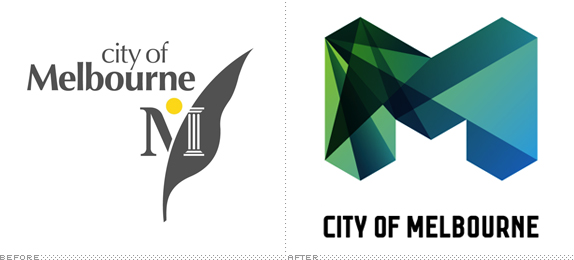
McGarry cites the example of the new Melbourne logo released in July, 2009, a stylized M which can be used in a number of colour ways and identity lock-ups depending on its application. The Melbourne logo was designed by leading design and brand identity company, Landor, and was the result of a separate research process before the design work was even undertaken.
Said McGarry: “It is dynamic, effective cutting edge design backed up by a robust design process.”
What the Designers Institute don’t tell you is that the professionally designed Melbourne logo cost an outrageous AU$240,000 which is what can happen when designers are tasked with creating a logo for a big entity.
City of Melbourne paid $A91,000 in “preliminary research for the new brand” and $A148,000 for the design itself.
Melboune’s Lord Mayor at the time said: “Of course, any dollar amount ignites ire in people and it’s so easy to say “$A240,000 for a fat blocky M?”. Yes, that’s what things cost people, get over it.”
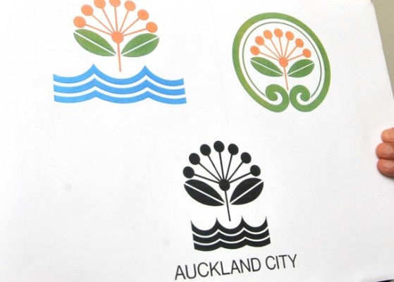
ARC chair Mike Lee says the new SuperCity logo’s “uncanny resemblance to the ARC Parks logo could tempt the transition agency to make it less like ours.”
This is the new logo:
This is the one worn for years on the shirts of ARC Park Rangers. It was designed in 1985 by ranger Tony Oliver, who is now principal ranger southern parks, with the help of other ARC staff.:
“I am amused the judges – including Waitakere Mayor Bob Harvey, art guru Hamish Keith, and former journalist and now John Banks’ campaign adviser Bill Ralston – picked the logo saying they thought it fresh and original, when it has been on display all over the Auckland region for years.
“This situation is a reminder that you should take the pronouncements of these self-appointed cultural high priests with a pinch of salt!
“That aside, I feel the choice of logo for the Auckland Council is a good one, symbolising the continuance of the ARC’s parks and environmental protection mission in the Super City.”




10 Comments
It admit is IS growing on me. And please don’t give us something horrible like Melbourne’s! We aren’t MTV (or ATV, or whatever it would be).
I don’t like it at all, but that might be because I havn’t been around for 70 odd years. I acually like the A the tourism agency uses, it’s colour can also be change to represent different situations.
All I’m saying is I don’t see why just because our transport is suck in the 70′s, everything else should be as well. This is our chance to get a fresh modern look, with fresh modern policies and hopefully fresh modern transport.
Filed in my storm in a teacup pile, as long as the Council set up works (and the Supercity won’t, not for the public anyway) the logo could be a bear taking a dump in the woods for all I care…
A friend of mine suggested the logo be an image of a motorway with the Monopoly man at one end counting his money, a true reflection of what Hide has planned for Auckland…
“This situation is a reminder that you should take the pronouncements of these self-appointed cultural high priests with a pinch of salt!
Ummm, OK lets stop. Not more supercity, back to how it is.
Seven nice citys each with unique and cool things about it.
htat will make the country better , make it seven citys.
Perhaps Govt could run National issues.
Purposed auckland style, okay.
Melbourne? Ewwww!
It’s not really Brand Auckland, just a logo to go on the rubbish bins, parking warden uniforms … ie council-related stuff.
Even though I don’t like how they devalue graphic design* as a profession with this contest, I’m starting to chill a bit now
* I am running a competition at my home for plumbers to come and install a new bathroom. I can do this myself, but hey, I thought the world of plumbing needed a boost. They get to work in my lovely house in the country, they must, of course do it for free, but the winner, to be chosen by me, will be advertised on my website and will get first use of the toilet. I will also run a story in the local newspaper which is bound to result in loads more work for the plumber. It’s win win! Please don’t all apply at once … (source)
The likeness of the proposal is far less like the Parks one than the direct copy of Triangle TV’s logo the new Auck. City one is now. I don’t know how they got away with it.
A logo should be a symbol representing the subject and that’s exactly what the new one does….Amalgamation of the cities and reflects Auckland’s coastline trees and colour etc.
I was going to submit a design but didn’t in the end. It was a stylised image of a motorcar which would represent who runs this “car city”.
You mean it represents the whole North Island’s coastline trees. It doesn’t actually differentiate Auckland at all. Just a common NZ tree.
The parks logo on the shirt in your picture is a later version of the original. Here it is as it appears greatly enlarged from a scan of a 1993 ARC publication: http://pixpin.com/viewer.php?file=ARC-Parks-logo-w2BB.jpg
I’m incredulous of the claim that the “new” logo was not informed by this old one.
Looks like a clipart image from microsoft word to me. It would be interesting to have seen some of the designs on the web for what was disregarded. I would suspect that there were some far more forward thinking logos or dare I say that word, ICON’s as the reality is that is what a logo is now a days is it not?